What the film sits on.
Grounds for the animation scenes and the title card, with the scene inset and given a boundary so it reads as an object on a surface rather than bleeding to the frame edge. Judge them on the composited stills, not the bare ones — a background only matters underneath something.
The grounds, bare
No foreground, nothing on top. You were right that they were barely visible — seven of the eleven were built below the threshold of visibility. All of them have been lifted; they should read at 1× with the slider left alone.
Subtract base level removes the #0b0f13 floor, leaving only the difference from flat
black. Gain then multiplies that difference. At 1× you are looking at the real signal — which is now
a spread of 33 to 40 levels rather than the 5 to 15 it was. Pushing the gain up is still useful for seeing
where a ground puts its contrast, and for checking nothing is hiding in the shadows.
Gain 1× is what the film would look like, so the slider is a diagnostic, not a preview — and you were right that it was doing too much work. Seven of these were built so faint they were below the threshold of visibility: spreads of 5 to 15 brightness levels out of 255, where anything under about 8 is invisible on a normal screen. That was a design error, not a viewing problem.
All eleven have now been lifted and every tag carries two measured numbers. Spread is how far the ground travels from its darkest to its brightest area, out of 255 — the target band is 30–45: clearly a ground, still recessive under type. For the animated ones, levels/s is how fast the busiest 40 px patch changes, which is the proxy for "does it pull the eye". Under about 10 is calm.
They should all read at 1× now with the slider left alone. It is back to being a diagnostic — useful for seeing where a ground puts its contrast, not for seeing whether it exists.
Paper sits out of this. It is a light ground, so subtracting a black floor and multiplying is meaningless for it — the slider skips that tile and it always shows as it really is.

Pale sage, light from upper left, kraft far corner, fine paper tooth. The only ground here that is not dark — needs no gain to see.
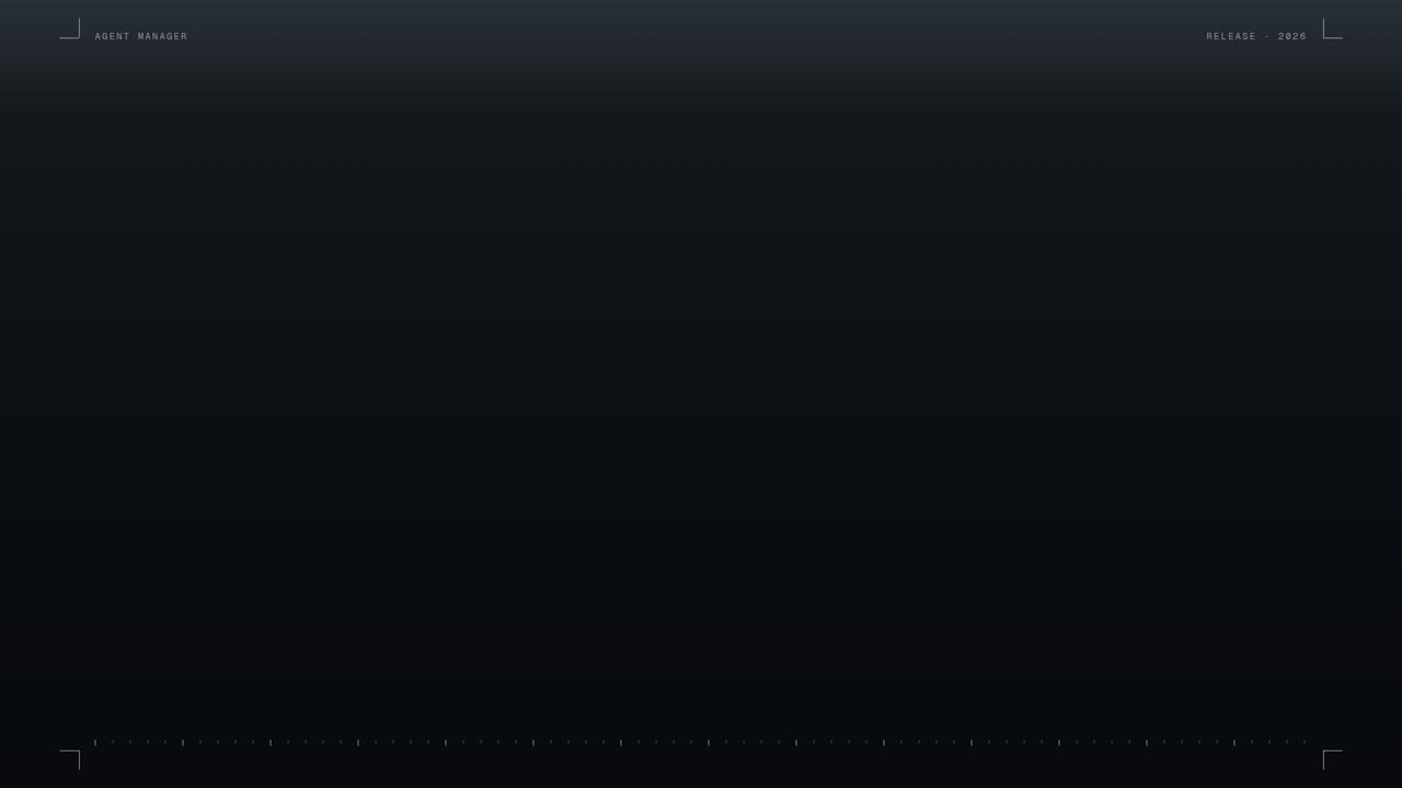
Flat plate, furniture in the margin: slugs, crop marks, a 20px scale. Evolution of Plate with the dot matrix dropped.

A machined housing a step lighter than the scene, scene recessed into it. The boundary is a bevel.

The mark's four-bar cadence at room scale, one column lit teal.
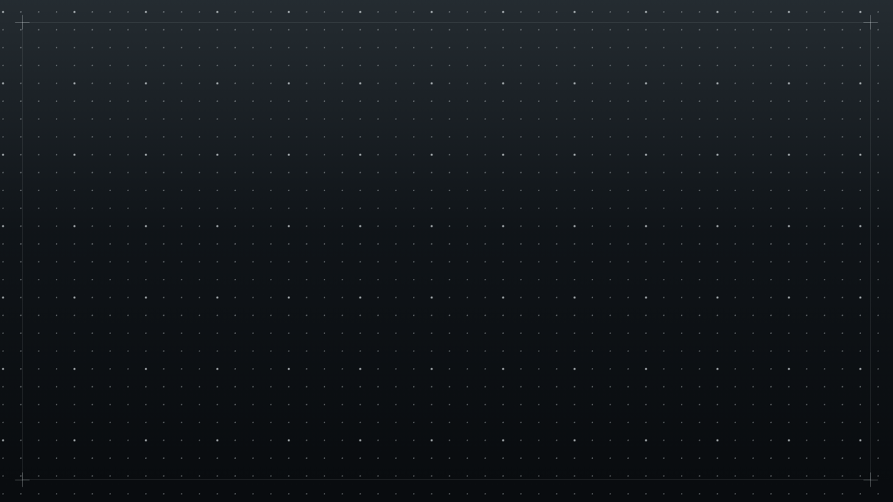
32px dot matrix, heavier registration dot every 128px, registration frame and corner ticks.

One light off-screen above the upper-left corner. Adds direction, adds no texture.
A sparse field of nodes whose links dissolve and re-form as the nodes creep. Seamless 6s loop.
A broad key light and weak accent fill swinging on a centre pivot, so the lighting direction changes across a shot.
Ten hairline channels carrying shallow standing waves whose crests creep. Nothing translates in bulk.
Near-empty ground; the boundary blooms on the scene's accent beats. Fastest motion here, and it is on the edge.
Two ribbons of light drifting on slow Lissajous paths. Exact 6s loop.
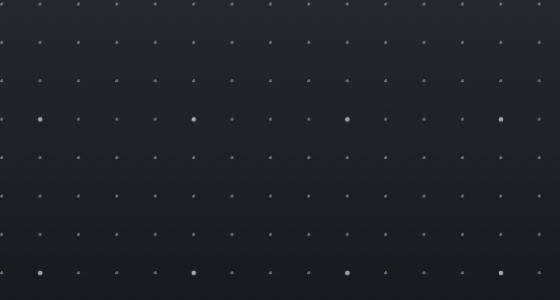
The tiles above are shown at 1280 px wide, a mild downscale from the 1920 px plate. These crops are actual pixels at actual size, so nothing is hidden by resampling:


Full-resolution PNGs if you want to open them in something else: Ledger · Plate · Rake · Sessions · Bezel · Paper


Intricate grids
Three answers to the grid brief — fine detail at the level of a technical drawing, with cells that light and migrate. One of them is deliberately not square.
A map sheet: 40px module, a tick on every one of 1372 intersections, brackets on every fourth, edge pips, index numbers and a scale in the margin. Eight accent cells lit, the lit set migrating once round the sheet per loop.
The non-square one: axonometric drafting paper at ±30° on a 46px edge, ticks rotated into the lattice, lit rhombi, and three lit volumes standing up out of the plan.
Nested subdivision. An 8×5 partition where every block already carries its eighths as pips; ten blocks at a time wake those pips and grow a quadtree down to 15×13.5px cells, then subside.
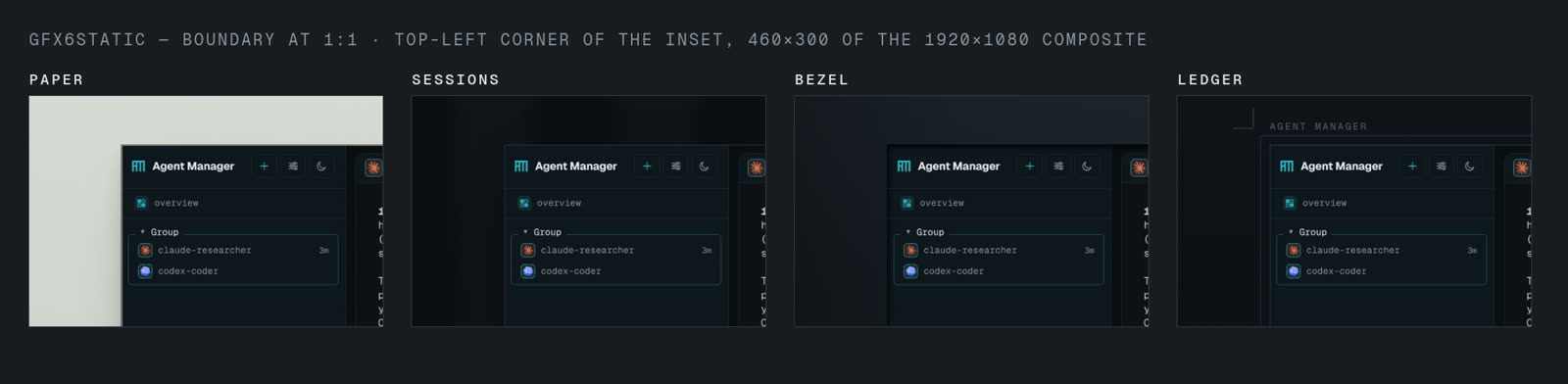
These lose the most to being shown small, so look at actual pixels. Every tick, bracket and pip below is a 1px print mark:
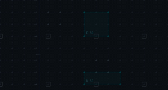
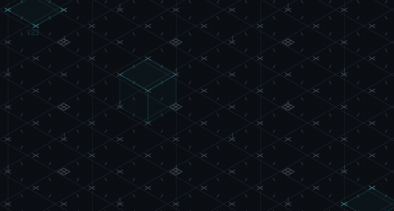
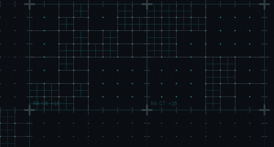


Quadrant. It is the most complete answer to what you asked for, the calmest of the three, and alone among all eighteen options its mechanic means something: a region of work is picked out and divides into finer pieces, which is what the product does. Atlas is the safe one — a beautiful sheet, but the detail is uniform, so it is texture rather than an idea. Axon is the most distinctive rhythm and the densest; it is also the closest to reading as a HUD, though the lit cube stays dimmer than the ticks around it and never moves, which keeps it the right side of the line.
Every highlight is a raised cosine over a four-to-five second life, so nothing snaps on. Detail survives both the encode and the downscale — 96 % of detail contrast through h.264, 87–89 % through the resize.
Drift with noise
Three ways of combining the drifting ground with pixel noise. All measure in band, and all three keep the drift itself under 9 levels/s — the higher figures are the grain, which is spatially incoherent by construction.
Drift under film grain resolved every frame — three octaves at 1, 2 and 4 px, with the grain amplitude tied to the local light, so the ribbons show up as tooth rather than as a separate layer.
Single pixels and 2–4 px clusters snapping on and dying within one to four frames, some of them dropping the pixel instead. The birth rate follows the drift, so the ground reads as a density of events.
The drift printed through a 7 px halftone screen at 18°. Dot radius is the light, and the flicker is dot rims crossing pixel boundaries — there is no random number anywhere in its moving part.
This is the one family where the page cannot show you the thing. The tiles are 1280 px wide, and downscaling averages fine grain away: measured on the actual files, activity falls from 28 → 8 for Sift, 16 → 9 for Fleck and 11 → 10 for Sieve. The spread survives, because that is the drift; the shimmer largely does not. So what you see in the loops above is roughly "drift with a texture", not "drift that flickers".
It is the resize, not the codec — at full resolution the encode is honest, holding 26.6 against a source 28.3. So here are true-quality three-second excerpts at 1920, which only download when you press play:
Full quality, 1920×1080: Sieve (4 MB) · Fleck (13 MB) · Sift (31 MB)
There is a strategic point buried in those file sizes. Six seconds of Sift at honest quality is 211 MB. If the finished film is ever compressed for social or the web at ordinary bitrates, a random per-pixel flicker is exactly what gets destroyed first — so this family may not survive distribution at all. Sieve is the exception, because its flicker is structured rather than random: halftone rims crossing pixels compress like a pattern, which is why it is a tenth the size of Sift and loses least to the resize.





Sieve. It is the only one of the three where the noise and the drift are the same object rather than two layers stacked — the dots are the light, so the texture describes the movement instead of decorating it. It is also the calmest, the smallest by an order of magnitude, and the one that survives both the resize and any future compression. Printing through a screen is a good fit for a film that already speaks in crop marks and registration ticks.
Sift is the most beautiful at full resolution and the least practical — 211 MB for six seconds, and the first thing any encoder throws away. Fleck is the one I would not use: the agent that built it said so itself, and it is right — it decorates the light rather than describing it, and in a still it is just a starfield.
Ready now — the first round
These three predate your note about insetting the scenes, so they are shown full-bleed: the scene fills the frame and the ground only shows through the empty areas. They are still the fastest way to see how much ground is worth having at all.
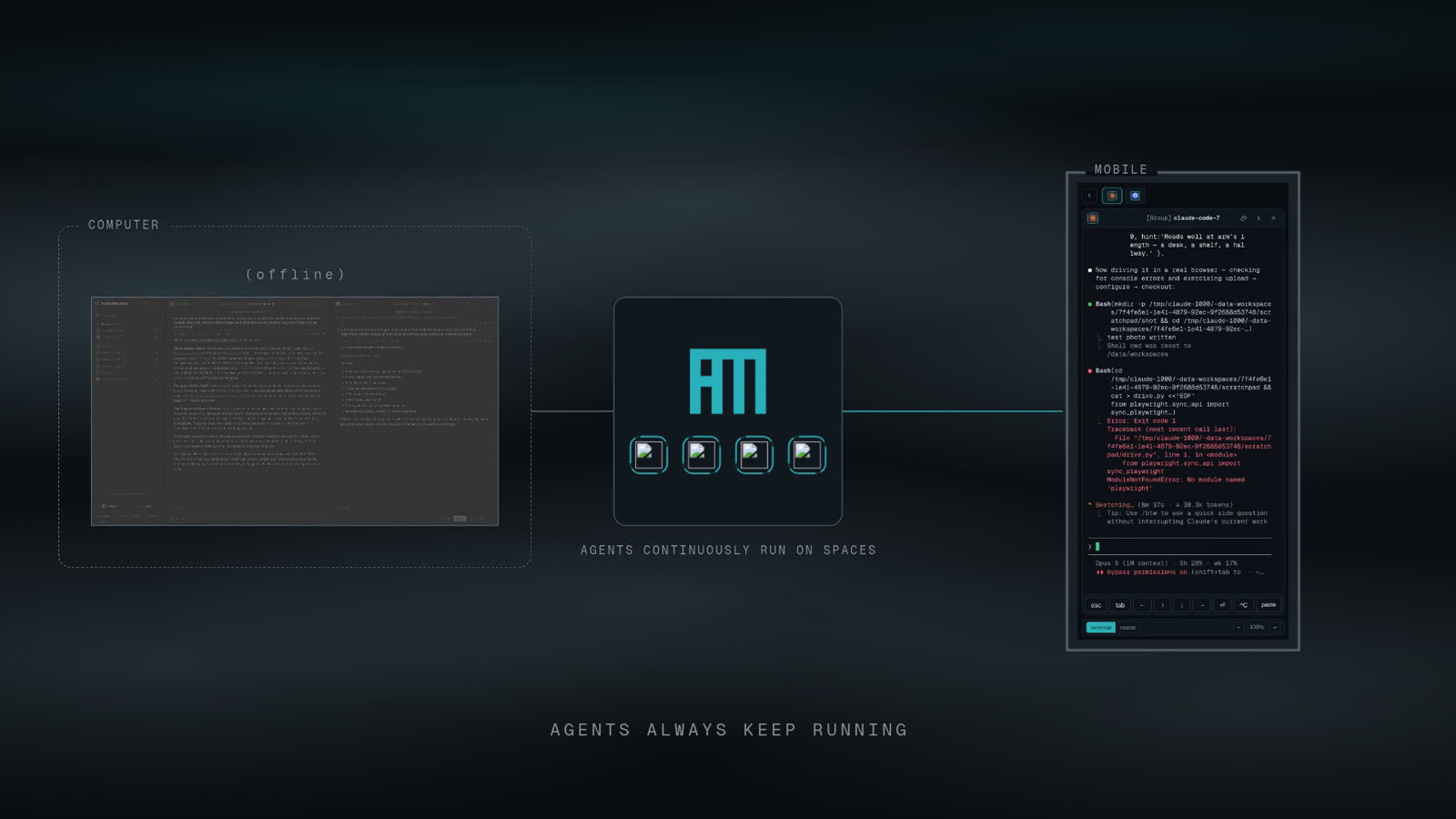
A · Drift
animated · 6 s exact loopTwo neutral ribbons of light drift across the frame on slow Lissajous paths, so the crests meander and it reads as a wave rather than a vertical gradient. The single teal crest is confined to the empty top band.
- Legibility
- −11.2 % contrast at worst, on the (offline) label.
- Risk
- The only option that can pull the eye mid-shot. Motion in the ground competes far more than texture does.
B · Plate
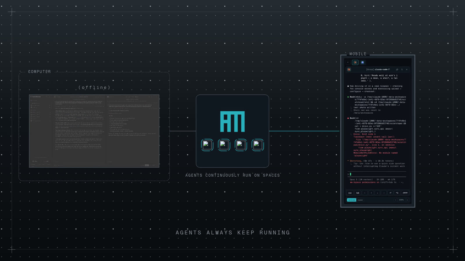
my pick of the threeA drafting surface: a 32 px dot matrix with a heavier registration dot every 128 px, a registration frame and corner ticks. Strictly black and white — no accent anywhere in the ground.

- Legibility
- Best of the three — 3.5 % mean cost, 4.9 % worst.
- Why
- A drafting surface is the right register for a tool that runs terminals: it reads as instrumentation, not decoration. It is also the only one that survives being static without looking like a flat fill.
- Against
- The busiest of the three, and the only one putting a repeating pattern next to type.
C · Rake
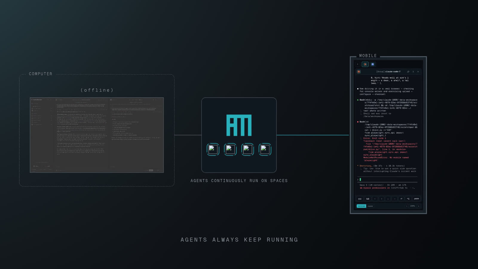
staticOne light placed off-screen above the top-left corner. #0b0f13 stops being the floor and
becomes the middle of the range; the far corner falls to #070a0c. Adds direction, adds no texture.

- Legibility
- Worst measured — −12.9 % on COMPUTER, which sits in the lit corner. Fixable per scene by choosing which corner the light enters from.
- Why
- Safest choice if you want the ground to disappear. The agent who built these three preferred it for exactly that.
Static, inset — the four you asked for
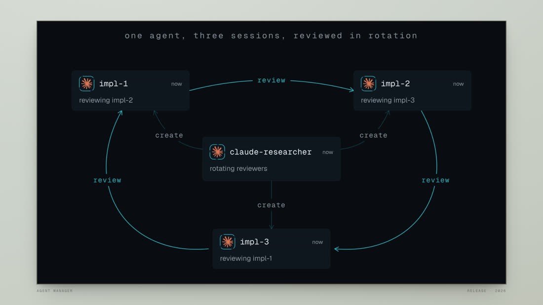
Scene reduced to 1660×934 of a 1920×1080 frame, centred, each with its own boundary at that edge. Shown under the app capture, because a ground that only works behind a diagram is no use.
The measurement that matters is not about the backgrounds at all. Because the inset plate is opaque, none of the four costs any contrast inside the scene — nine small labels measured 0.00 % change against a flat ground in every option. But insetting at all costs −13.5 % on small monospace text, simply because the scene is now smaller. That is the price of the whole idea, and it is the same whichever ground you pick.
It is affordable here because the app capture is already framed loosely. If we later push into a pane, the inset has to come off for that shot.
D · Paper
my pickPale sage #cbd2c9, light from the upper left, a kraft far corner and a fine paper tooth. The
dark scene stops being a screen and becomes a card lying on a desk. Boundary: a 1.5 px kraft keyline
with a two-stage contact shadow, so it sits on the surface rather than floating.

- Why
- The biggest contrast to everything built so far, and a direct callback to the launch film you pointed at in the first place — where the product appeared as paper cards on a desk. It is also the only one of the four that makes the app capture read as an object rather than a window.
- Cost
- No contrast cost inside the plate. But the margin is 26× brighter than the scene, so the film gains a light frame around a dark picture. That is the whole point, and it is also the thing to be sure about.
E · Ledger
staticA flat plate with the furniture moved out into the margin — slugs, crop marks, a 20 px scale. The declared evolution of Plate above, with the dot matrix dropped because it fights terminal type. Boundary: a double rule, hairline plus accent at 9 px.

- Why
- The safe pick. Everything Plate was after, minus the thing that made Plate risky.
F · Bezel
staticNo texture at all: a machined housing a step lighter than the scene, with the scene recessed into it. Boundary is the bevel itself — inner shadow along the top and sides, light catching the lower lip.

- Against
- The bevel is 13 px deep, so it eats 3.3 % of the plate — six times more than the other three. It is the only option where the boundary is thick enough to notice as a thing in itself.
G · Sessions
static · weakestThe mark's own four-bar cadence, blown up to room scale on a ground set below the scene's black, with one column lit teal and cut in half by the plate.

- Against
- A 130 px margin is not enough room for a rhythm to be a rhythm. You see fragments, not a pattern. Would work if the inset were much smaller — which is a different brief.
Telemetry sits at 27.6 levels/s — three to five times the other three. I could have had it calmed to match and chose not to, for two reasons.
First, the metric does not distinguish a thin bright line creeping from a link appearing out of nothing. A 2 px line moving one pixel produces a big local change while looking perfectly calm; that is most of Telemetry's number, and at 1:1 it reads as the quietest of the four despite measuring the loudest. Lattice's original 80 was the other kind — filaments popping in and out — and that one genuinely needed fixing.
Second, the creep is the idea. Slowing it far enough to move the number would leave an instrument that has stopped. The argument for calming it anyway is a fair one and worth stating: Echo's churn is cued to the scene's own beats, so its motion means something, whereas Telemetry's is continuous with no narrative reason. If you pick Telemetry and it reads busy to you in the cut, it is a one-line change.
Animated, inset — the four
Same inset spec. "Interactive" read as alive: motion that echoes what the scene is doing rather than a decorative loop running blind. Watch the clips — in a still these are almost indistinguishable, by design.
All four are deliberately near-invisible. At actual size the ground moves by one to three levels of brightness, so a still cannot show it and neither can a video encode — h.264 flicker is the same size as the signal. Each option therefore comes with an amplified strip: the bare ground with its floor subtracted and the difference multiplied ×14, so you can see the shape of the motion rather than guess at it.
Legibility is a non-issue here — worst single element across seven elements and three instants was −0.9 %, and Rake actually measured 1.1 % better than a flat ground. That is a veil holding the ground back to ~40 % under the type and letting it run full in the margin.
The number that matters is the second one: how fast the fastest 40 px tile changes, in brightness levels per second. Under about 1 is invisible; above about 3 starts to pull the eye in peripheral vision.
H · Lattice
my pick of the animatedA sparse field of nodes whose links dissolve and re-form as the nodes creep — so the ground is a network. Boundary: 1 px hairline with a soft inward shade. Loops seamlessly.

- Motion
- 9.2 levels/s. First pass came back at 80 — bright filaments turning over too fast — so the orbits were slowed to 6 s and the node creep cut to 2.7 px/s. Calmed without dimming: the spread held at 36.
- Why
- It carries the film's own idea rather than borrowing a texture, costs nothing measurable, and needs no per-scene tuning.
I · Rake
animated · runner-upThe static Rake from the first round, set moving: a very broad key light and a weak accent fill swinging on a centre pivot, so the direction the ground is lit from changes across a shot. Boundary: a conic hairline that brightens on the edge facing the light. Seamless.

- Motion
- 4.7 levels/s — the calmest of the four, and the fast part is the boundary rather than the ground.
- Why
- Better than Lattice on the title card, where a network in the margin has nothing to do with the words. Measured better than flat for legibility.
J · Telemetry
animated · quietestTen hairline channels, most carrying a shallow standing wave whose crests creep. Nothing translates in bulk — it is an instrument at rest. Boundary: an instrument bezel, double rule and corner ticks, deliberately static. Seamless.

- Motion
- 27.6 levels/s — now the busiest of the four. Thin bright lines produce a large local change even when they only creep, so it reads calmer than the number suggests. Left as-is deliberately: see the note at the end.
K · Echo
animated · not recommendedA near-empty ground where the boundary takes a faint accent bloom on the scene's own accent beats — arrows landing, sessions flipping, "shipped". The most literal reading of "interactive" on offer.

- Motion
- 7.6 levels/s, in bursts on the scene\u2019s beats rather than continuously.
- Against
- Fast motion at the edge of frame is exactly what peripheral vision is tuned for, so it competes with the thing it is meant to be flattering. It also has to be hand-timed to every scene's beats, which is real work on every future edit for the least return.
Reference · flat
what we have nowIf you want my answer
Paper (D) for the film, Lattice (H) if you want it to move.
Paper is the one that changes the film rather than decorating it: the dark app becomes an object on a surface, it is the strongest callback to the launch video you started from, and it costs nothing inside the plate. Its one real question is whether you want a light frame around a dark picture for ninety seconds — that is a taste call, not a technical one, and it is the only reason I would hesitate.
If the answer is "keep it dark", then Lattice: it is the only animated option whose motion means something, it is slow enough to stay invisible, and it needs no per-scene work. Telemetry is the cautious version of the same instinct. I would not use Echo.
And the thing to decide first, because it applies to all eleven: insetting costs −13.5 % on small monospace text. If that bothers you on the app captures, the answer is to inset the animations and the title card only — which is what you originally suggested — and leave the app captures full-bleed.